All Colors Are Not Created Equal
I’ve never met a color I didn’t like. Well, that’s partly true. Every color has a place somewhere in nature or in graphic design. Interior paint colors are a different story.
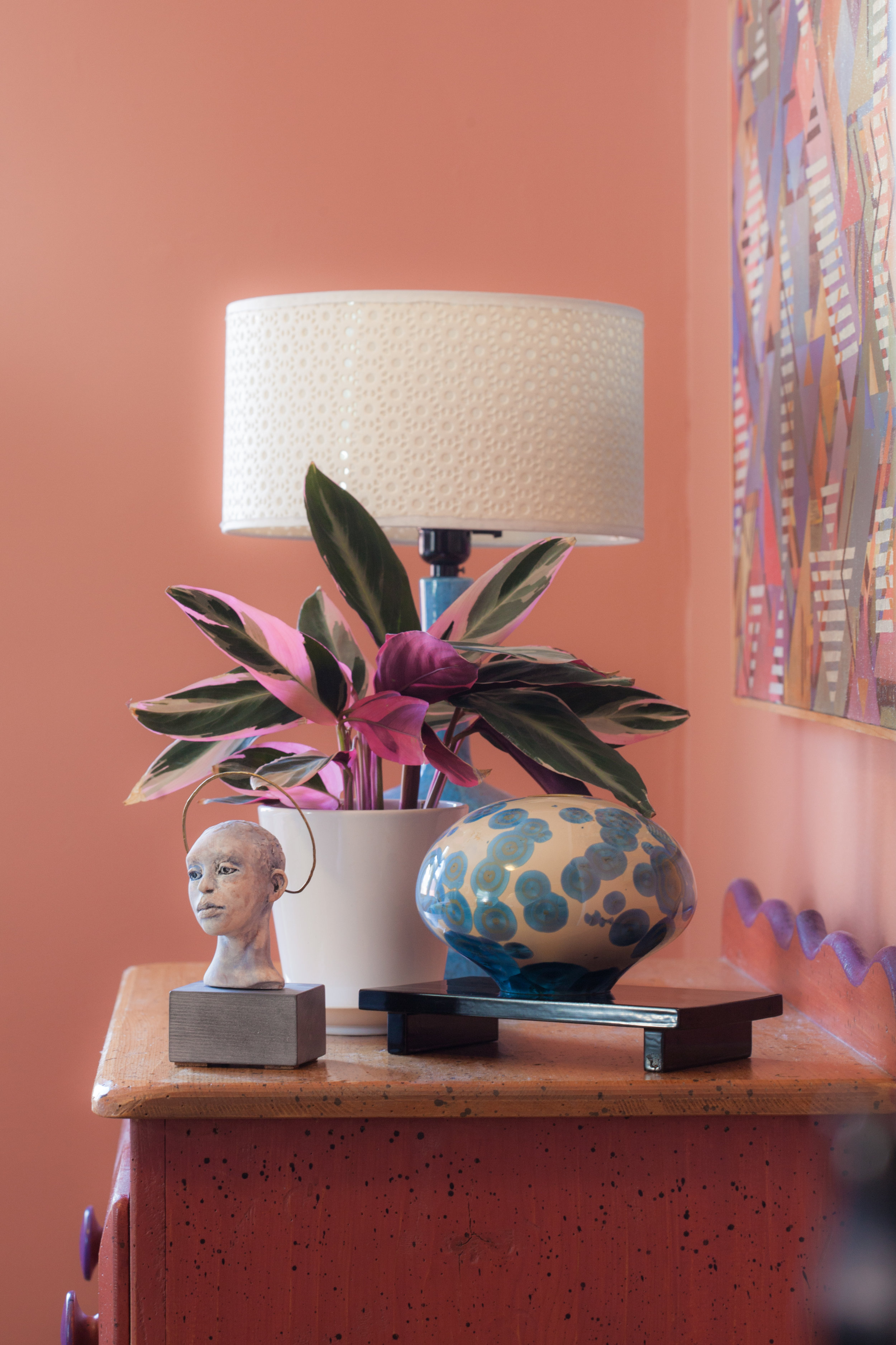
If you choose colors that are too saturated your home will become what I call “circusy”, a term I coined for using color when it goes over the top and is agitating rather than pleasing to the eye. I’ve worked with several artists who want to choose colors for their walls in the same manner they select colors for their canvases. Believe me, it doesn’t turn out well. In the back of every paint deck there is a section called “brights”. Never use these for your walls. These colors need to be “grayed down” by about 75%!
I am a color fanatic. Often people are surprised when I ask them to paint their entire house a soft white. White is the very best backdrop for color!
If you are just moving in to a new space and don’t have a clue what your furnishings will look like and don’t have the faintest idea of a color scheme… painting everything white is the perfect blank canvas. You can add color later when you have a more concrete plan.
I am very consistent in my choice of white for kitchens and hallways. I like to add color in bedrooms, offices and dining rooms. My advice: never paint every room a different color and that includes beige! I believe that your eye needs a place to rest between colors and white offers that space to breathe.
Always, always buy the samples first and put large swatches, the bigger the better, up on the walls or on large sheets of cardboard. Those tiny rectangles in paint decks can only get you started. I’d rather my clients spend $50 on samples rather than waste money on an entire paint job.
This is critical! Paint looks different in every light and in every space. Put samples on several walls in the same area and look at them at different times during the day before making a final decision.
Another biggie for me: if your home has an open floor plan and all of the rooms flow together without doorways surrounded by casing then, definitely paint everything the same color… preferably white or another neutral.
On several occasions, clients have been terrified when walking in to their all white home. It can be startling when it’s empty of furnishings and the finishing touches. All have thanked me later for sticking to my guns and insisting that white was the right choice… often it is.
Here is a true secret… my favorite white ever is Westhighland White by Sherwinn Williams. It is a fantastic solution for brightening up homes with low ceilings, not much natural light or those with dark wood trim around the doors and windows… bungalows for instance. You may want to go a bit creamier if you have high ceilings and tons of natural light.


